Showing posts with label Comics. Show all posts

Thursday, April 1, 2021

Much More Than A Three Hour Tour

I fell down a rabbit hole recently. Well, it was actually a foxhole, but more on that in a minute. Through a rather round about way (starting with a discord post with a couple of comics from Little Tales, reading it's entire archive, and then making my way from there) I discovered a web comic that has been around for 8 years now. It's called Isla Aukate and is written by Gen (of the previously mentioned Little Tales) and drawn by Fox (remember the foxhole gag?) and centers around islands of anthropomorphic animals that live on the Calendar Islands in the Pacific.

Comic Logo Copyright Foxtayls LLC

As of this writing, I am not only 100% current with the comic but I have also pledged my support on Patreon. This is one of the best web comics ... no, one of the best COMICS that I have read, and, as you know, I have read A LOT of comics. There are a few reasons that I say this.

First, is the art. I get a real Don Bluth feel from what Fox does with the art. The overall look, yes, but the expressions that she puts on the faces and the attention to detail is just amazing. The art is unfinished (if you're reading the sketch comic), but it is still great and you get everything you need. When she does long shots, like with the bar, it's just amazing. This lady makes her living as an artist and you can see why,

Secondly, we have the writing. This is some really in-depth stuff. All of the characters are three dimensional with good and bad points, as well as long histories. Add to that the overall history of the islands (They even thought about what the MONEY looks like and why!), and you have such a rich world that it feels very much like something Tolkien would come up with.

Oh, and just in case you think "They've got anthropomorphic animals, so it must be a funny animals comic", it isn't. There's murder, attempted murder, war, interspecies relationships, parental issues, etc, etc. It is very much a mature comic, and not in the "skimpy clothing and swearing" idea of mature, either. (Although the invented swears are great.)

Finally, is the ladies behind the comic. I have had limited interactions with them online, but they are both great people. They welcome new readers with open arms and welcome questions. Whether they give out answers is another thing 😉. (This is a comic that they try and make money on, after all, so spoilers will cost you.). You couldn't find two nicer people on the internet. The fact that Gen is my age, and gets my humor, is a bonus.

So, if you're looking for something to read that's outside the mainstream, but is WELL worth your time, look no further than OverlordComic.Com. Just be warned, once you start reading, you won't want to stop.

Thursday, April 2, 2020

Space Battleship Yamato: The Classic Collection

I recently finished reading Space Battleship Yamato: The Classic Collection, which is the comic book version of the original Star Blazers. As a HUGE fan of the anime, I really wanted to read this and, on one level I'm glad I did. On another, not so much.

You see, the manga was being developed in parallel with the anime, and it shows. If you read this without having seen the original show, then you'd have quite a few moments where you'd say, "Wait, where did THAT come from?" One of the most jarring is that, at the end of the first part, two ships leave Iscandar after the Yamato does. The first is Captain Harlock (who is a cyborg space pirate always covered in a shroud) and the second is believed to contain Starsha and Mamoru Kodai (aka Alex Wildstar for us Americans). The odd part there is that the last time we saw Mamoru was in the battle of Pluto where his ship was destroyed. There's no trip to Titan in the manga, where the crew find's Mamoru's ship in the anime, and there's pretty much nothing shown on Iscandar. So this revelation really comes out of nowhere.

I'm sorry to say it, but this collection is more "tell but don't show". Many of the iconic scenes from the anime are either missing all together, or are mentioned as "We'll tell you about that when we get back" and then never mentioned again. The story also isn't complete. Yes, the Earth is saved, but then the second arc featuring the Comet Empire is severely abridged and doesn't even have a conclusion.

I'm sorry to say that I can only recommend this to people who are already Star Blazers fans, and then only as a curiosity. Personally, I think it's telling that it only took me 3 nights of reading before bed to finish a 644 page manga.

Now, to finish on a high note, here's the opening theme to Star Blazers 2199:

Thursday, March 14, 2019

The Evolution of Comic Covers - Marvel Edition

Last week, commenter Kirk asked for a Marvel version of my analysis, so here it is. I took one of his suggested titles, The Amazing Spider-Man, but I decided to do it a little differently. Since Marvel hasn't been around as long as DC (regardless of the 75 years hype), I chose to start with Amazing Spider-Man #1 and then go with every 60th issue beyond that (61, 121, 181, etc) to give a nice 5 year span. Let's see what we can learn from this.


We start out, as I said, with Amazing Spider-Man #1. As was the style of the time, we have a picture representing one of the two stories in the book. The Comics Code stamp is easy to see, as are the price, issue number, and the fact that there are two stories in the book, the first of which deals with Marvel's highest selling book. Spidey has a speech balloon, but that probably should be a thought balloon. While the book's title isn't in the position it would take up later, is it is the same style we would come to know. Also note the little "MC" in a box, the only indication that this is a Marvel comic.


Five years later we have a more dynamic picture and the corner box has appeared. We have the title of the story on the front, but no speech balloons. The Comics Code stamp is slightly smaller than before and off on it's own, still. We also have "MCG" in it's own box, even though "Marvel Comics Group" is in the corner box.


Now in the 70's, we see the appearance of the "Marvel Comics Group" banner across the top of the cover. This links the corner box with the Comics Code Stamp, which looks to be the same size as five years earlier. We have a lot of text on this cover, both in Spidey's word balloons and Gerry Conway's description of what the consumer can find within. Note how the Spider-Man in the corner is not actually in the corner box, but just next to it on the cover. The image on the cover, though, isn't a scene in the story, just a representation of what's probably going on.


60 issues later and the banner/corner box set-up remains largely unchanged. The only exception here is that the corner Spider-Man is now in a separately colored box as part of it. Much less text here, just the story title, but the Amazing Spider-Man title is larger, now going over to the arm of the Spidey in the corner box. Not being familiar with this story, I'm not sure if what is shown here actually happens inside, but it looks like it could.


We're now in the 80's and, except for the image in the corner box, most is the standard stuff is unchanged. The series title seems to have shrunk back down to where it was, though. No text on this one, just John Romita, Jr's art letting you know what to expect. With the eyes floating over the Vulture, I'm going to say that this is a poster image and not a scene from inside.


This is certainly a poster image and not showing what's going on in the book. We do have some text telling us what to expect, if not the story title. We now see a corner box more like what evolved over at DC, where the issue number, price, date, publisher logo, and Comics Code stamp are all in one place, along with an image of the hero.


Ah, the 90's. While the art is heading the way that most Marvel did in that decade, the corner box is the same, other than the new Marvel logo. We now have the "Part One" box, indicating the larger story going on. This is also the first time we've seen some non-banner text above the series title. Again, I don't remember this story but I'm pretty sure that something like this image could have occurred inside the book.


Later in the 90's, the corner box has been paired down somewhat. The Comics Code stamp, now about half the size that it was, is off on the right side of the cover again. The image of Spider-Man has been replaced by his logo only. We're back to a poster style image, but we do have what appears to be the story title.


In the early 2000's the corner box, and the Comics Code stamp, is gone. We do now have the creator names added to the cover for the first time. The image seems to be something from the interior of the issue, but we have no text telling us what's going on.


Later in the decade and we have our first change to the series title, with the creator names above it. There is also a banner down the left-hand side with the story title and it seems to be coming from a modified corner box. The main part of the cover is a painted poster of Spidey "Back In Black", which has to be at least the 3rd time he's been in a version of that costume by this point.


Five years on and we certainly have a stunt poster image, since J. Scott Campbell did not do the interiors, but I'm pretty sure it boosted sales. We have the creator names for not only the main story but also for the back-up, but no indication of what's going on in either of them.


The last cover we're going to look at dates from 2011 and, in many ways, is a throw-back to much earlier. We still don't have a corner box and the creator names are there, but not only do we two descriptions of what's going on inside, but we also have word balloons! We haven't seen those since issue 121! We also have a scene that is representative of what's inside the pages and not a poster.

From looking at these covers, it seems that Marvel was on a steady progression with regard to design. That was probably due to the "house style" being part of the entire comic production and not only in the character designs. It started to loosen up towards the more recent years, but even into the late 90's it was a pretty consistent style across the whole line.

=========================
Like what I'm doing here on the blog and podcast? Why not check out my Patreon Page to see how you can help me do more? http://www.patreon.com/TheHammerStrikes

Thursday, March 7, 2019

The Evolution of Comic Covers

Due to a project that I'm doing for Paul over on Back to the Bins, I've been seeing a lot of comic book covers recently. What has struck me is that we are pretty much back where it began. Let me explain that by using Batman, a character continuously published for 80 years, as an example.


This is a cover from the 1940's. What we have is a "poster" image that may or may not reflect what's inside the book. Other than that, we have the title, publisher logo, issue number, date, and price. Very simple and, except for the Joker's presence, we don't get any information about the story.


This cover comes from the 50's, and now we have the Comic's Code stamp prominently featured. In addition to the information we had in the 40's, we now have a speech bubble indicating that Ace is a new member of the team, so he'll probably feature in the story. We still don't know what that story is, though. (Yes, I chose this cover because Ace is on it.)


Here we are in the 1960's and now, in addition to even more speech bubbles, we have the titles of the two stories inside, one of which is represented on the cover. There's much more information to help the consumer decide whether this is an issue that they may want to pick up. Note how the Comic's Code stamps has shrunken from it's premiere.


Now we've made it to the 70's and the cover is less verbose, with only a few speech balloons and no story title. The image does seem to represent something that happens in the story, so maybe a title isn't necessary. The Comic's Code stamp is even smaller now. We also have the beginnings of a corner box, where the issue number, date, and price are all in one place.


In the 1980's we have the corner box also including the, now even smaller, Comic's Code stamp. No speech bubbles but we do have a story title and the promise of a reveal inside the issue. We also have the addition of the creator names, which is a nice touch.


In the 90's, the pendulum started swinging back. We have no story title or word balloons. Everything else is still present, even though the Comic's Code stamp is even smaller. The image seems to be more poster-like and probably not representing something that actually happens in the issue. We do get the obligatory crossover title, though, something there was a lot of starting in this era.


In the 2000's the Comic's Code stamp has practically shrunk out of existence, but the story title is back. This is definitely a poster image, though. The corner box has also been broken up, with the price moved to the UPC box.


This is a cover from a few years ago. What we have is a "poster" image that may or may not reflect what's inside the book. Other than that, we have the title, publisher logo, issue number, date, and price. Very simple and, except for the the fact that it's part of "Zero Year" in "The New 52" era, we don't get any information about the story. So we're right back where we began in the 40's. No corner box, no Comic's Code stamp, although we do have the creator names added.

It's an interesting cycle to look at, but I think the most balance was struck in the 70's and 80's. You get a good amount of information about what's in the issue, but it doesn't overwhelm the cover itself. Too much or too little on the cover doesn't do the issue any favors, in my opinion.

=========================
Like what I'm doing here on the blog and podcast? Why not check out my Patreon Page to see how you can help me do more? http://www.patreon.com/TheHammerStrikes

Thursday, November 15, 2018

The Voice of Superheroes


This past Monday we lost another giant of comics, Stan Lee, co-creator of many of the world's favorite superheroes. To me, though, Stan will always be the voice that I heard while watching my favorite characters on Saturday mornings. Here are a couple examples:


Stan's is the default voice I hear as the narrator whenever I read a comic, whether it's Marvel or DC. He was a great talent that I'm sorry to say I never got to meet. If there's any justice in the universe, Stan is now reunited with his beloved Joan, who died last year, and with Jack Kirby & Steve Ditko, to create even more masterpieces. Excelsior!

=========================
Like what I'm doing here on the blog and podcast? Why not check out my Patreon Page to see how you can help me do more? http://www.patreon.com/TheHammerStrikes

Thursday, July 19, 2018

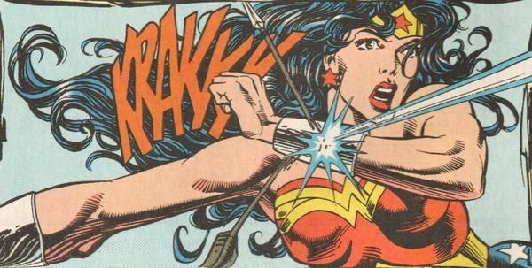
Wonder Woman Is Not Bulletproof


I'm not sure why, but I've been hearing a good amount of questions regarding Wonder Woman and whether she is bulletproof or not. The reasoning goes that she can take a punch almost as well as Superman, so her skin should be tough enough. Well, it's not quite that simple.

Diana is tough, no doubt about it. However, the Goddesses granted her enough resilience to handle her powers, but they didn't make her invulnerable. Think of it this way, a normal human can take a blunt impact, like a punch or even just running into a piece of furniture, and get away with, maybe, a bruise. An arrow, on the other hand, would pierce the skin and cause serious injury.

It's the same way with Wonder Woman. Blunt impacts, or just impacts that can be spread out over an area, will hurt but aren't deadly. Bullets, or anything with a large impact over a small area, will hurt or even kill her. That's why she has to use her super-speed and indestructible bracelets to deflect bullets.

I should point out that my information comes from the Post-Crisis Era of DC, after the George Perez revamp. If you're talking about Post-Flashpoint, then all bets are off as I have no experience with that version of Diana.

=========================
Like what I'm doing here on the blog and podcast? Why not check out my Patreon Page to see how you can help me do more? http://www.patreon.com/TheHammerStrikes

Thursday, January 18, 2018

I'm Not Mad, Just Disappointed

It might be an aspect of getting older, but I've found that I just can't get worked up about entertainment anymore. There was a time where I would have gone off on a rant about Todd McFarlane giving Spider-Man mask eyes the size of his head, but not anymore.

Why, yes, my eyes do go from above my eyebrows to below my cheekbones.
Part of it could be that I'm just not going out of my way to watch stuff. I'm not current on any of the Marvel or DC TV shows. I pick and choose the movies that we go to see. I don't read any current comic books. Even so, if I do see/read something, I just can't get mad about it. I either think it's OK, or that it's not for me and move on.

I suppose this is why I just don't get the "This is the greatest/worst movie/TV Show/comic book EVER and if you don't agree with me, it's because you're not smart enough to understand!" I've heard that WAY too much, especially with regard to any DC movies starting with the Nolan Batman stuff. Look, it's great that you feel so passionately about something, but there are all kinds of tastes out there. Just because you think this is the best depiction of your concept of Batman doesn't mean someone who doesn't even like Batman has to agree with you, even if you accuse them of being stupid for not doing so.

There's enough entertainment that I know I like, or that I think I'll like but haven't watched/read yet, that I really don't need to seek out any of the stuff that I'm pretty sure I won't like.

Now get off my lawn!

=========================
Like what I'm doing here on the blog and podcast? Why not check out my Patreon Page to see how you can help me do more? http://www.patreon.com/TheHammerStrikes

Thursday, September 28, 2017

Baltimore Comic-Con

The world's newest superhero - The Midnight Cat!
This past weekend our family took a trip down to Baltimore Comic-Con, which was a really good time. Believe or not, this convention actually focused on COMICS! There were some great creators there, including Jerry Ordway, Walt & Louise Simonson, Mark Waid, Joe Staton, Paris Cullins, and Karl Story. There was also enough room to actually move around, which I've found to be a rarity at bigger conventions.

What was really nice, though, was there was specific programming for kids. Kira was able to take part in a few of the workshops, including Superhero University (as you can see above). She had a great time and got to discover a lot of new kid-focused books.

I think the highlight of the weekend, though, was meeting people. I knew that Tom Panarese was going to be there, as he has gone for the past several years and he took his son last year. We met up at Thom Zahler's table, and had fun chatting. We met up again later at the kid's area and who should show up but Darrin & Ruth Southerland along with Chris Calloway! The next day we say Darrin & Ruth again, but this time they had Michael Lane with them.

It was a really fun weekend, with great friends and a good amount of comics fun. We might just go back next year.

=========================
Like what I'm doing here on the blog and podcast? Why not check out my Patreon Page to see how you can help me do more? http://www.patreon.com/TheHammerStrikes

Thursday, May 25, 2017

Blank Backgrounds

The Incredible Hulk #289
I might be showing my age, but I remember a time when there were several panels in comics that had "blank" backgrounds (see above). I have no problem with something like this, where the characters are in a battle. I think it adds more focus to the action and keeps the page from getting over-detailed.

That's not to say that doing away with backgrounds, or just drawing the most basic of backgrounds, is an okay thing to do in most cases. I like to see Kirby Tech as much as the next guy, but I think I prefer this kind of simplified approach when it comes to fight scenes. Unless, of course, the background plays a part. Such as the Hulk picking up a big piece of the aforementioned tech to smash down on the Abomination. That kind of thing always trumps on style.


=========================
Like what I'm doing here on the blog and podcast? Why not check out my Patreon Page to see how you can help me do more? http://www.patreon.com/TheHammerStrikes

Thursday, March 16, 2017

Starting a New Collection


A few months ago, I decided that if I want to collect something other that Quasar appearances, then I could do worse than get every issue that was cover dated for the month that I was born. That would be December 1975, for those keeping score. I haven't started on this yet, but if I come across any in my travels I might just start out.

What kind of odd comic collections to you have? I know Scott Gardner has his Disney Parks collections (parks appearing in comic issues and issues featured in WDW itself), but does anyone else have something like that?

=========================
Like what I'm doing here on the blog and podcast? Why not check out my Patreon Page to see how you can help me do more? http://www.patreon.com/TheHammerStrikes

Thursday, March 2, 2017

Organizing Comics

One of my "hodgepodge" boxes
Not so recently, Alan and Emily Middleton went through how they organize their comic book collection on an episode of Shortbox Showcase. That seems to have touched off quite a bit of responses from their listeners on how each individual does it. Well, this is yet another bandwagon that I'm going to jump on, though I may have still a different take.

You see, I don't have a lot of comics any more. In fact, I only have three long boxes and three short boxes. That's it. Most "new" comics that I read now are digital, which means that I don't need to store or organize them. I don't have a lot of boxes, but I figured that I would go through a couple and show you how they're put together.

I tend to go by character, which makes it easier to find things, and then by chronology. Let's take one of my short boxes for example. This one is for Quasar. It contains his series as well as other appearances that I have for him, going from oldest to newest. That means that issues of Avengers that happen between issues of his series are placed in between those issues in the order.

Next we have a Superman long box. This is all Post-Crisis stuff, starting from Man of Steel #1 and moving forward. Many of the issues that I had were damaged in a flood caused by a little storm called Sandy, and had to be trashed. What I have left is placed in order of story, so you have Adventures, Action, & Superman all mixed in. The Triangle Numbering made it easier, but I went and did that to the rest of the titles as well. I also have any "Year One" or similar type issues placed in chronological order as to when they take place. There's even an issue of Wonder Woman in there, which sets up her Action Comics appearance. As this long box isn't full of Superman, I also have related titles, like Superman/Batman in the back.

I do have some boxes that are a mix of things (see the Batman Beyond/Batman/Nightwing/Titans/Outsiders/Aquaman box above). One long box has PvP, Liberty Meadows, Strangers in Paradise (Michelle's), and Concrete, among other things, in it. They needed to go somewhere, so that's where they ended up.

I think that about covers it, and I would like to apologize to the librarians in the audience for making their heads explode.

=========================
Like what I'm doing here on the blog and podcast? Why not check out my Patreon Page to see how you can help me do more? http://www.patreon.com/TheHammerStrikes

Thursday, December 29, 2016

Top 10

I recently pulled out my trades for "Top 10" and reread them. This was one of the series that was recommended to me by the owner of our FLCS years ago.

For those of you not familiar with the series, it's basically "Hill Street Blues" with superpowers. Our POV character is rookie Robyn Singer, aka Toybox, who is starting at Precinct 10. The series takes us through several cases in the city of Neopolis, which is where all of the "Science Heroes" live.

This is right up my alley, as I love police procedurals, but I'm especially fond of the type that gives you all layers of the force. Here we have patrolmen, detectives, a sergeant that's an intelligent dog in an exoskeleton, everything I could want. So, of course I like it.

If this sounds at all intriguing to you, I'd recommend picking up at least the first twelve issues (see the link above). There are offshoots of those, and I like what I've read, but the original issues give you a really nice story that has a beginning, middle, and end while still leaving it open for more stories to be told. Kind of unusual in comics, which might be another reason that the series appeals to me.

=========================
Like what I'm doing here on the blog and podcast? Why not check out my Patreon Page to see how you can help me do more? http://www.patreon.com/TheHammerStrikes